Aetna
A new and cohesive visual toolkit across iOS, Android, and web platforms.
Client
Aetna
Role
UI Designer
Industry
Health

Overview
When I first joined the team, the highest priority was to work on the iOS and Android platforms due to a high-stakes launch within a few months. The business requirement was to update UI elements across the apps to fit a new brand identity. Following that work, we were also tasked with applying those UI adjustments to the web platform. The design team was given full support by the product and engineering teams to take the time and build Aetna's first design system.
Problem Definition
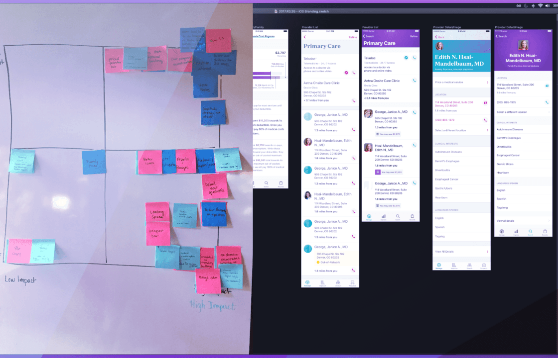
iOS & Android UI Refresh
After identifying the low effort/high impact tasks, we had a list of UI updates for each platform. Our changes included revamping:
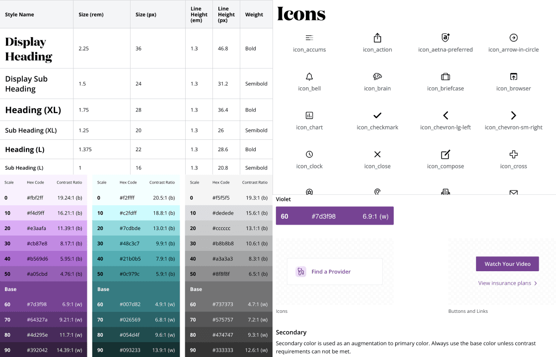
1. Typography
2. Color palette
3. Iconography
4. Platform-specific components and layouts
Our goal was for the UI to follow Material Design best practices for the Android app, and the most recent HIG standards for the iOS app. We collaborated closely with engineering teams to double check affordances, technical requirements, and the time/cost impact of our proposed updates.
Design System
One could argue that the mobile UI work might have been premature–waiting until after the design system was complete would have been beneficial. However, the time pressure from the business side made that approach impossible. On the bright side, completing the UI work allowed the design team to recognize platform-agnostic design patterns and helped us identify reusable components before starting on the design system.


Design Process
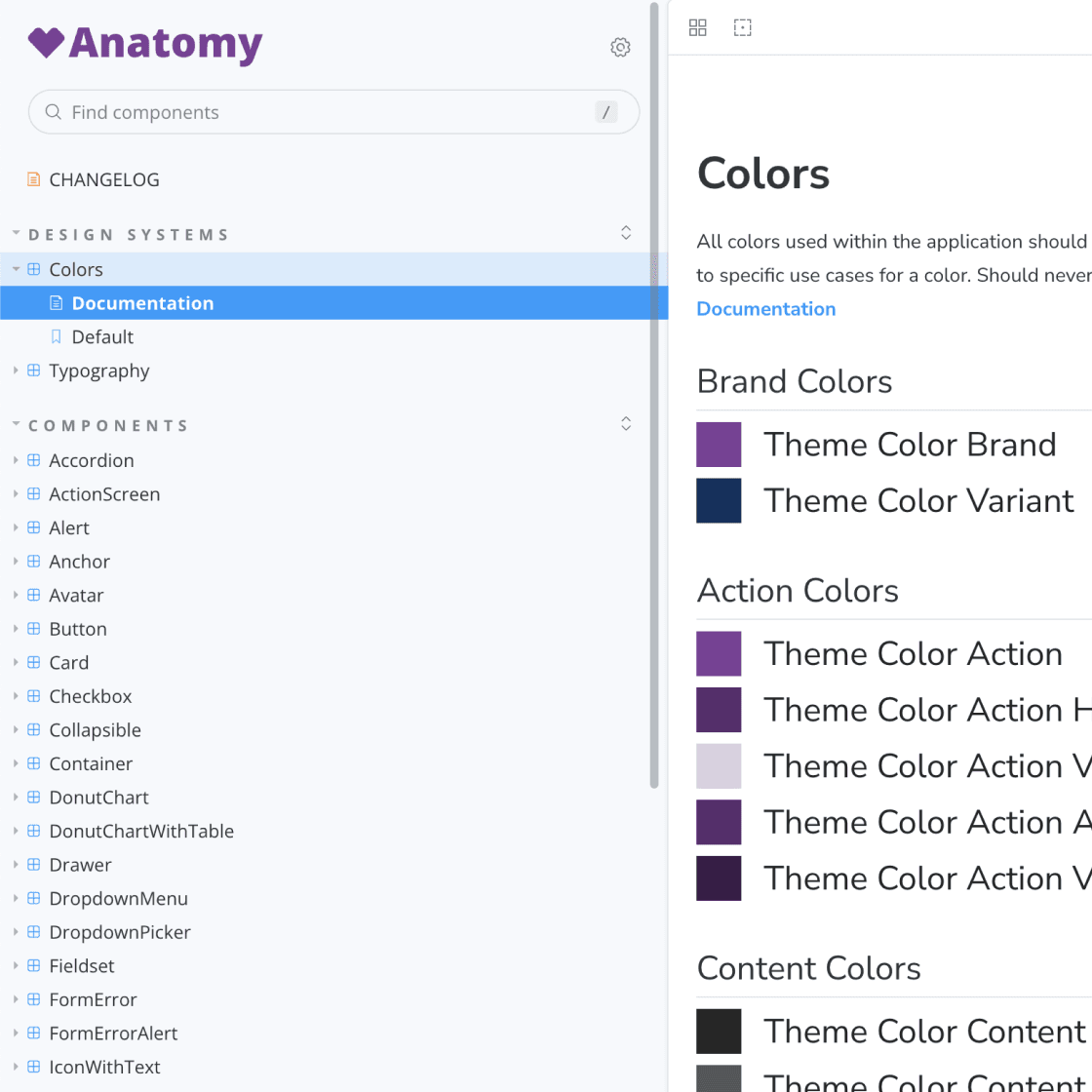
We approached building the design system by following the atomic design principles. Atomic design in a nutshell:
Atoms - UI elements that can’t be broken down any further and serve as the elemental building blocks of an interface.
(ex. Typography, Color Palette, Icons, Buttons, Form Elements)Molecules - collections of atoms that form relatively simple UI components.
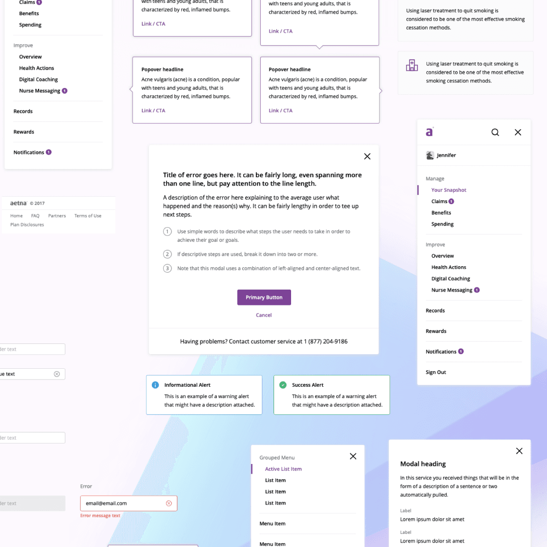
(ex. Fieldset)Organisms - are relatively complex components that form discrete sections of an interface.
(ex. Header, Card, Side navigation)Templates - Place components into a layout
Pages - Specific instances of pages, shows variations in templates
Given Aetna's diverse customer base, we made sure to thoroughly evaluate hierarchy, tone, and in-context visual accessibility throughout the design system. We conferred constantly and iteratively with React developers to make sure each design element was feasible to build and maintain.


Outcome
iOS & Android Apps
⭐ ⭐ ⭐ ⭐ 4.6 • 132.6K Ratings
The Aetna Health iPhone app is rated a 4.7 with over +240.9K reviews in the App Store.
⭐ ⭐ ⭐ ⭐ 4.5 • 17,291 Ratings
The Aetna Health app is top rated in Google Play with over +67k reviews.
Design System (V1)
Visual style guides for various states and use cases
A new illustration library of SVG assets optimized for a range of sizes
First iteration of web components
The formation of a dedicated design system team

Learnings
It is no small task to take on designing the first iteration of a design system that impacts millions of health consumers. I am very proud that our small team was able to build the library from the smallest component level up to complex page templates.
Our design leader emphasized frequent cross-collaboration across engineering and product teams. We received "buy-in" by publicly showcasing our work, hosting workshops/Q&A sessions, and engaging in quarterly presentations to the broader Aetna organization. Increasing the transparency around the design process helped convince the business to invest in design efficiency and ongoing design system maintenance efforts.
Before this project I had primarily built design systems and UI frameworks with code. This was a novel approach for me, where we used Sketch's new library feature to easily create components in tandem with multiple designers and a UI engineering team. This was an amazing opportunity to collaborate “on the other side”, mentor designers new to the idea of design systems, and help bridge the gap between design and engineering teams.